
We craft brands that move people to affection.
Hatch is a full-service branding agency with best-in-class talent, helping clients grow by appealing to consumers on an emotional and lasting level.
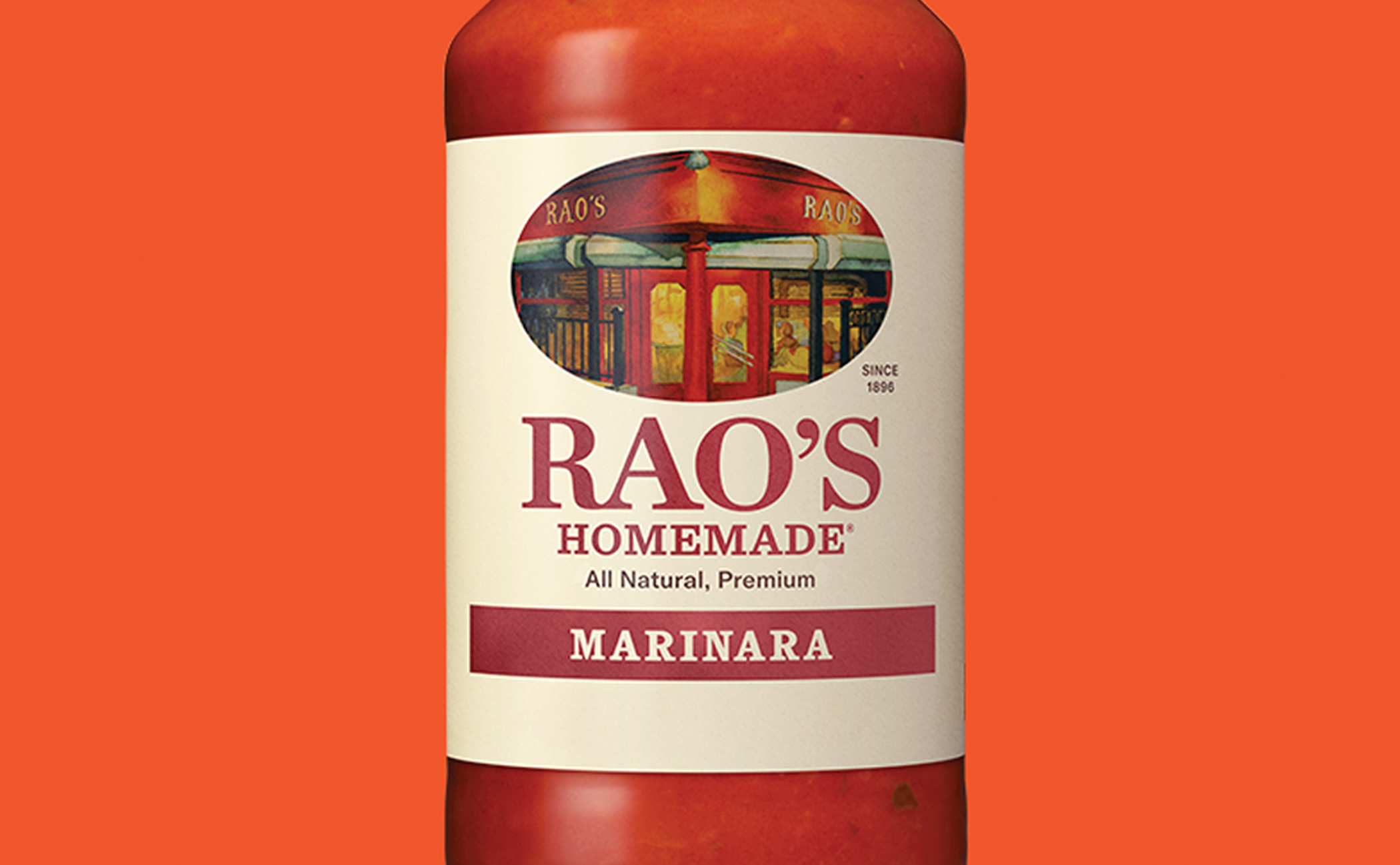
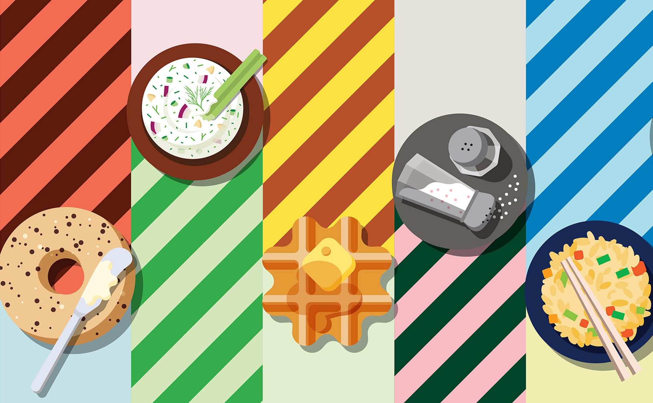
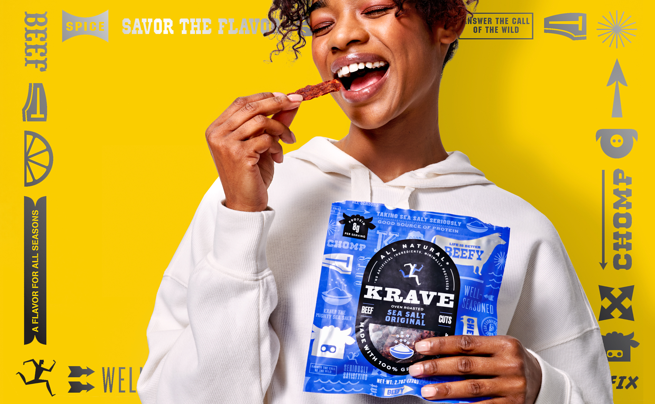
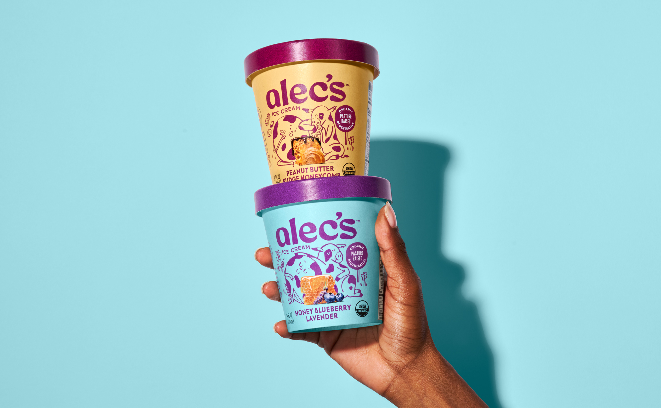
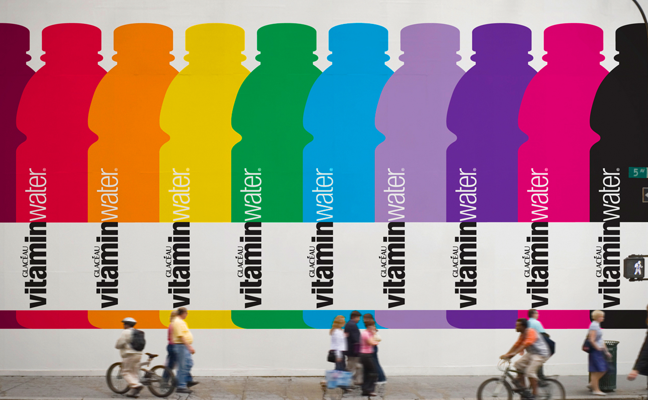
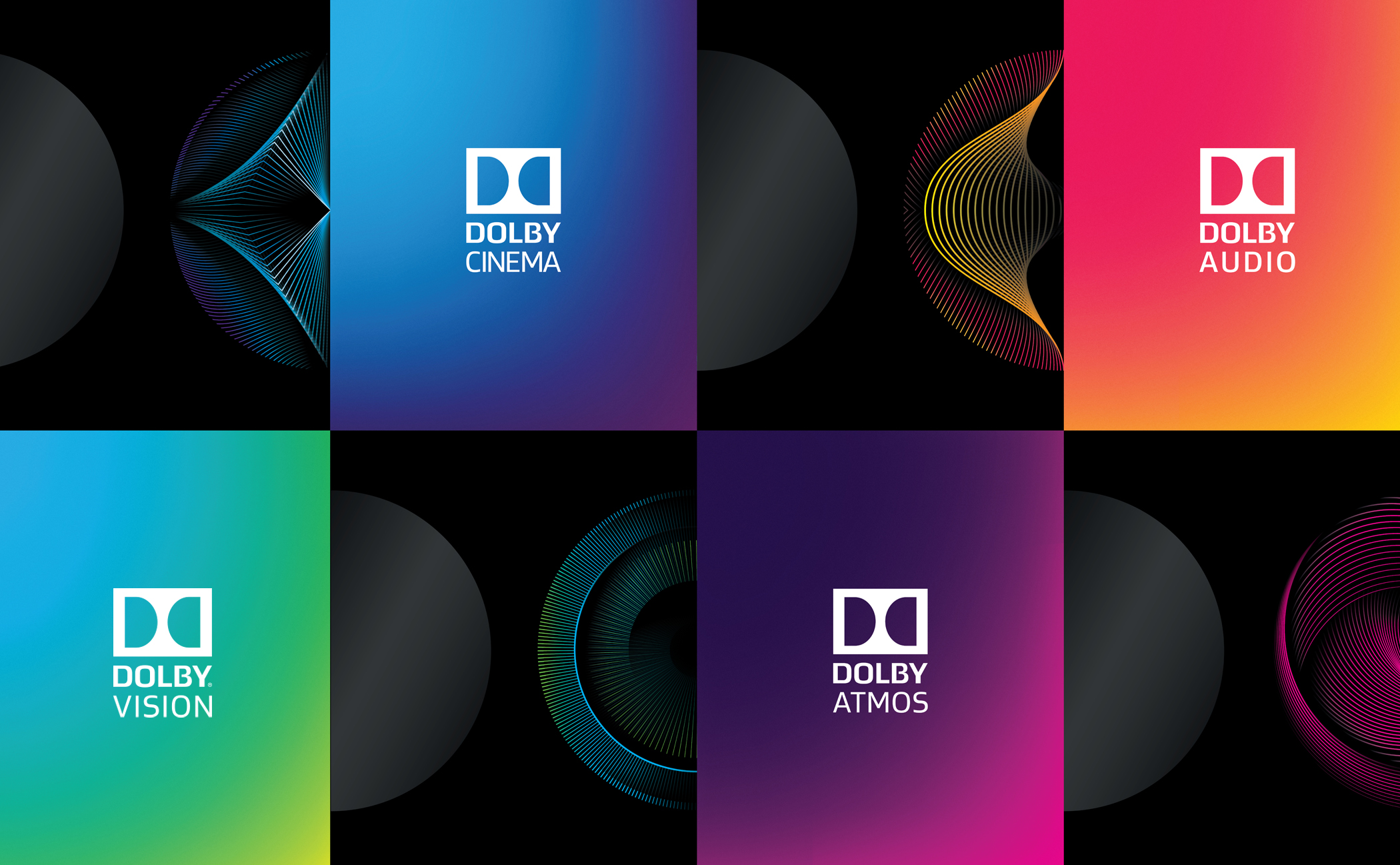
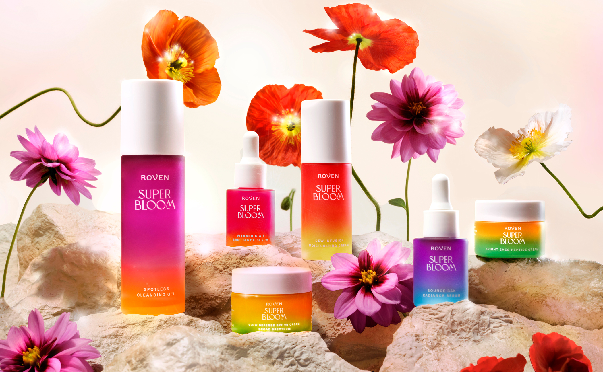
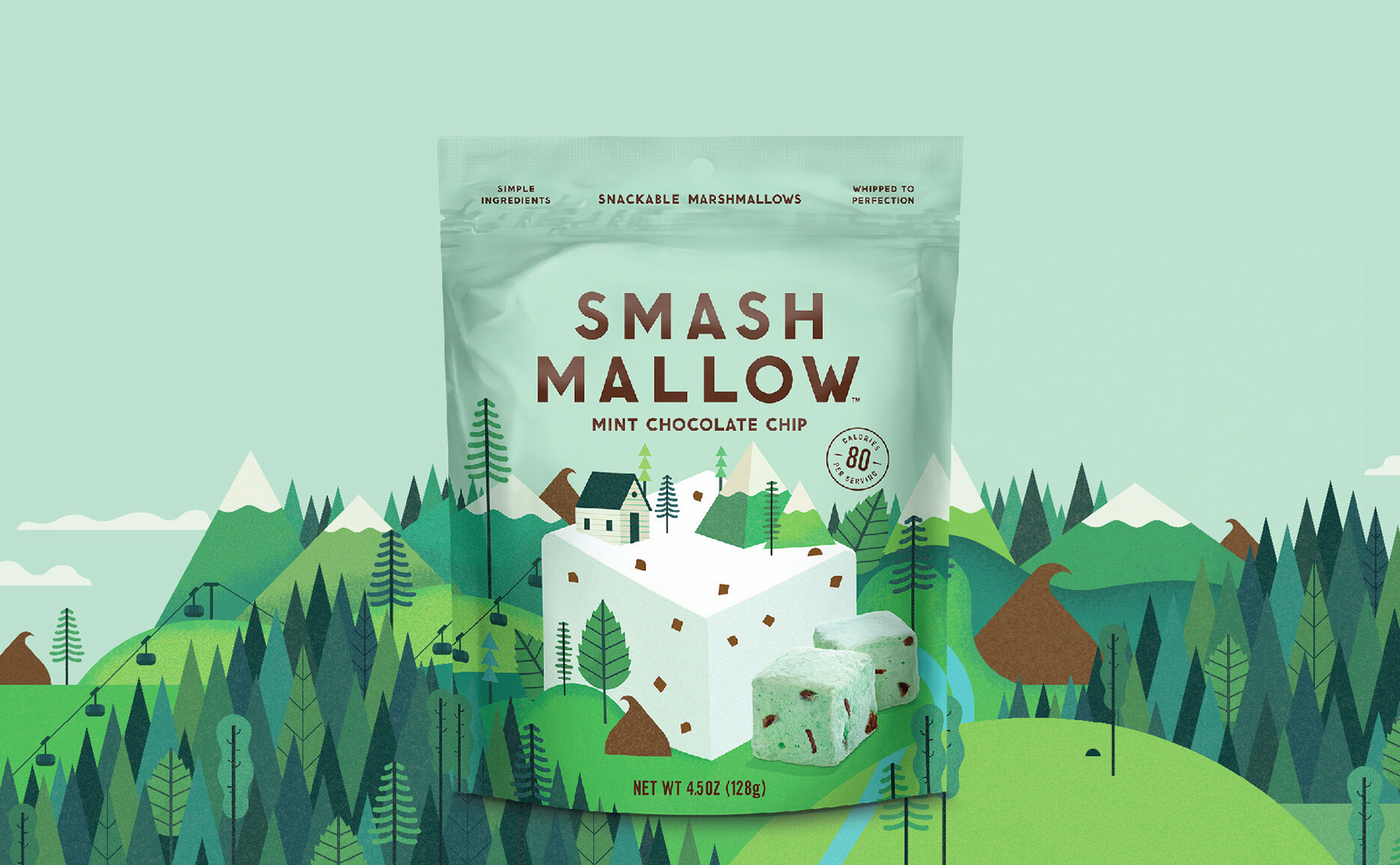
Explore recent work here. Interested in learning more? Let’s chat.