Krave Jerky
Strategy, Visual Identity, Packaging, Marketing
Krave Jerky
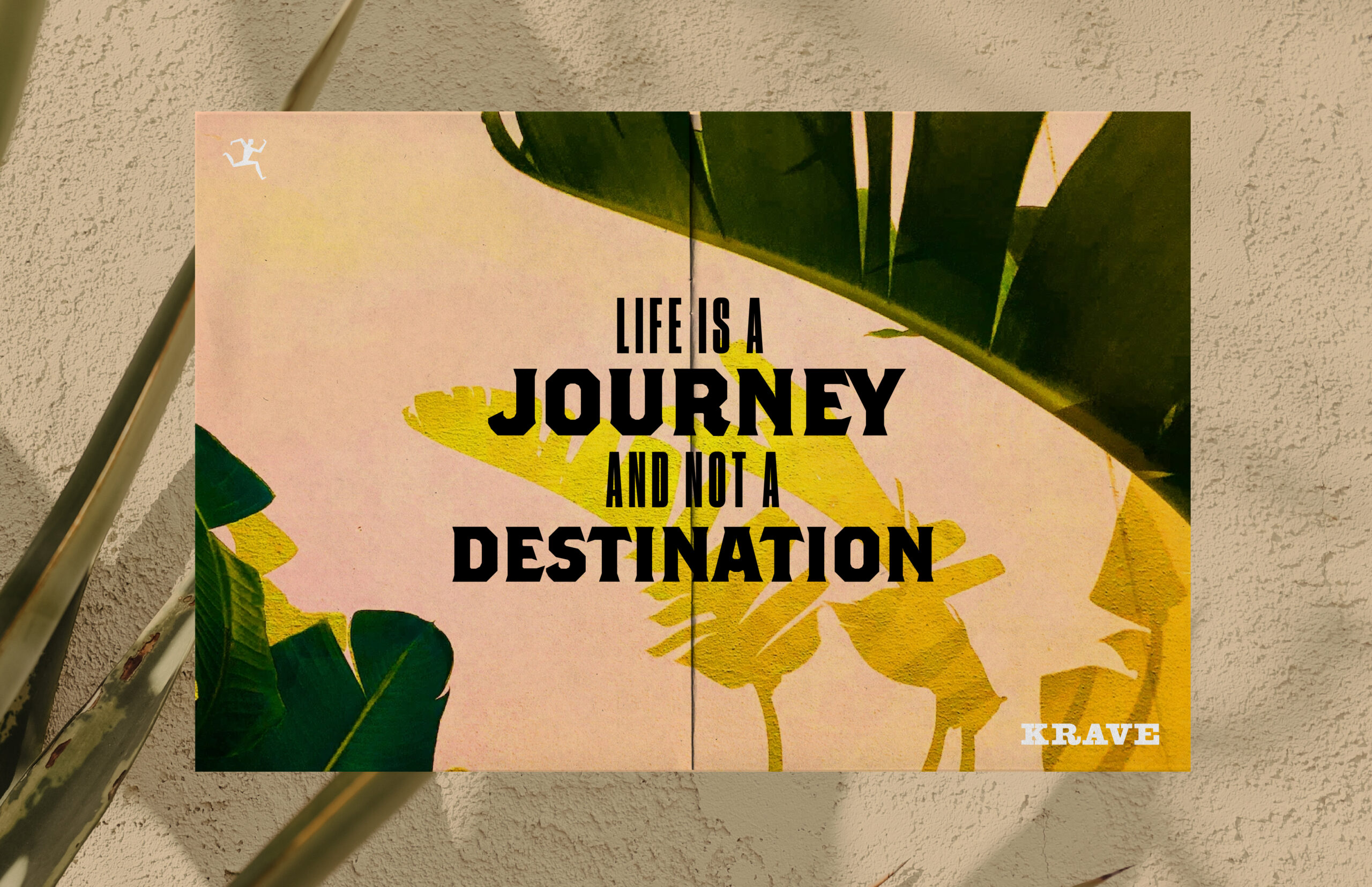
Sonoma Brands returned to Hatch to revitalize KRAVE’s full portfolio once again after re-acquiring the brand in 2020. The mission was to inject their spirit into the brand to stand out in a now crowded category and rebuild faith with previous consumers and retailers. Grounded in the belief that living a full life is a conscious choice at every step of the way, Hatch used the Sonoma Spirit to inspire the work.
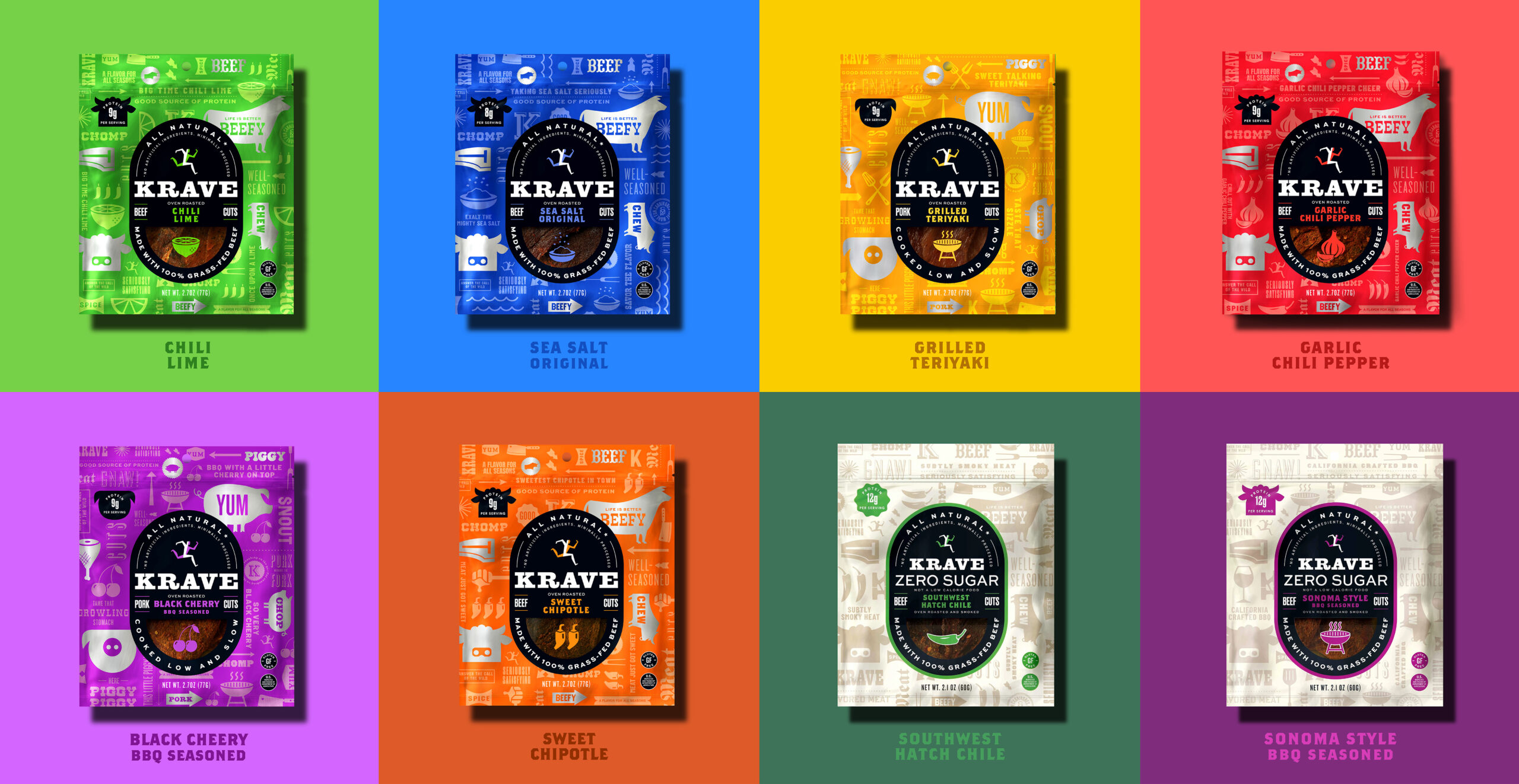
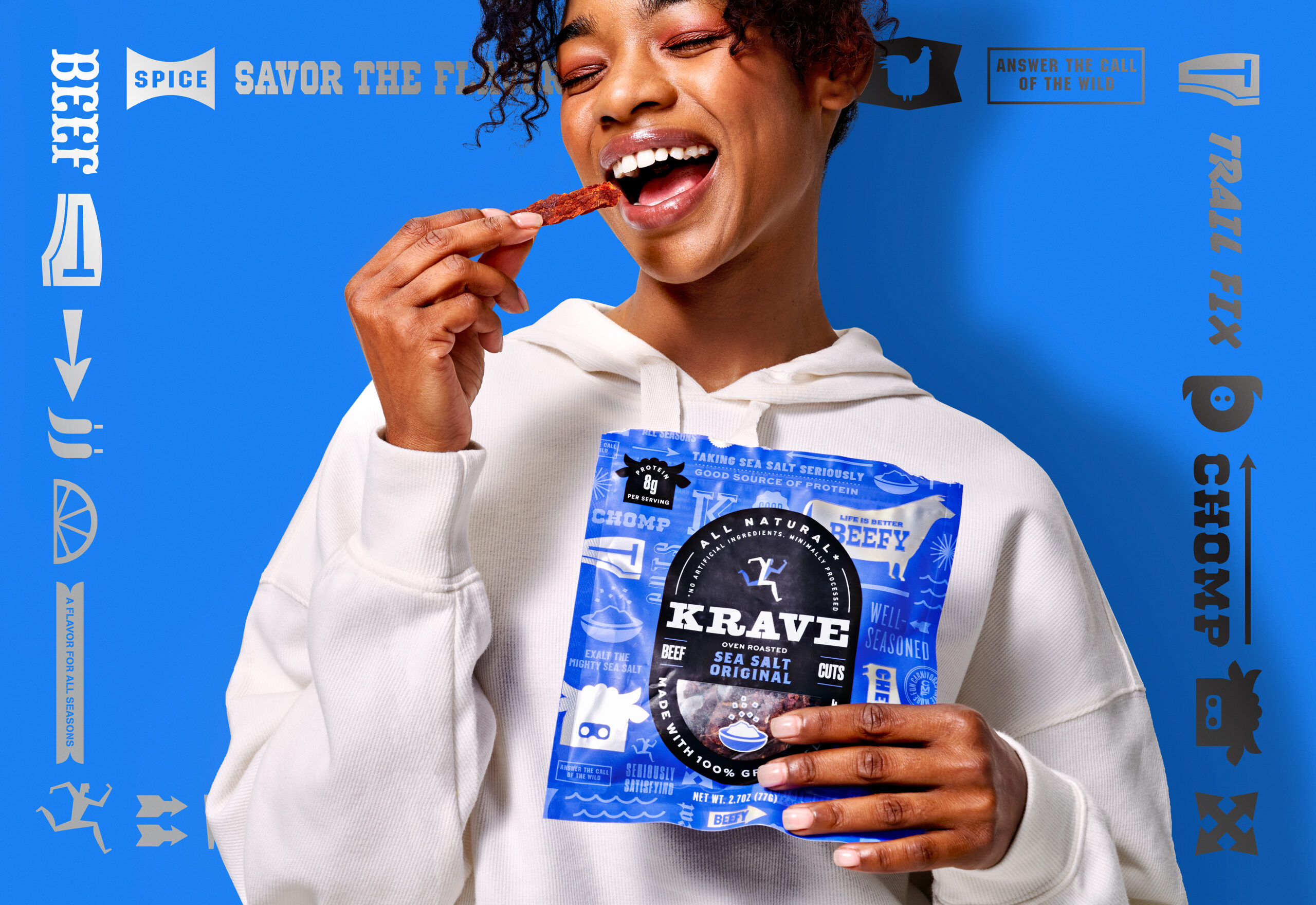
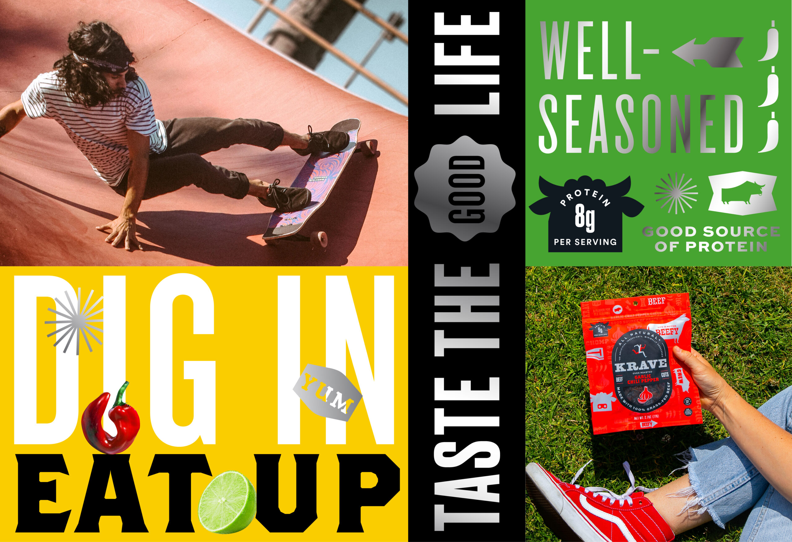
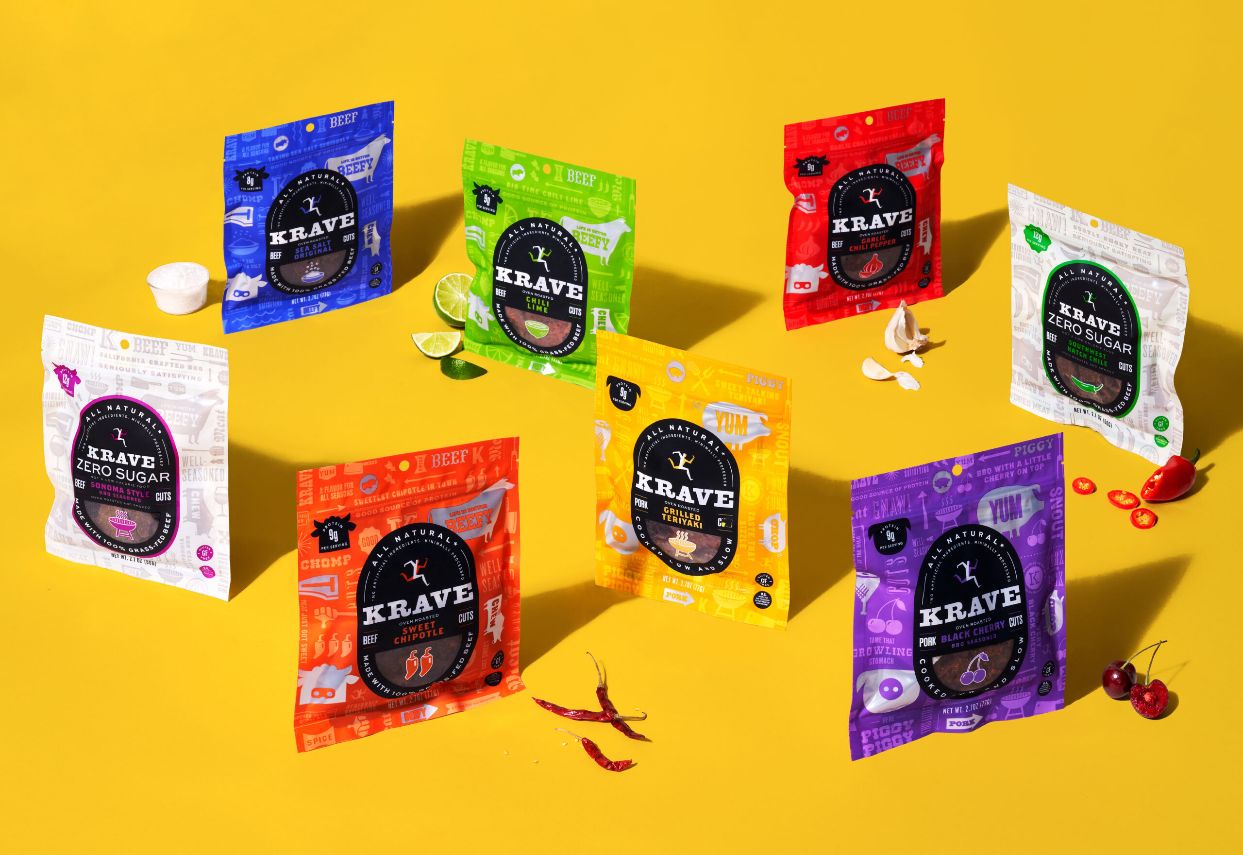
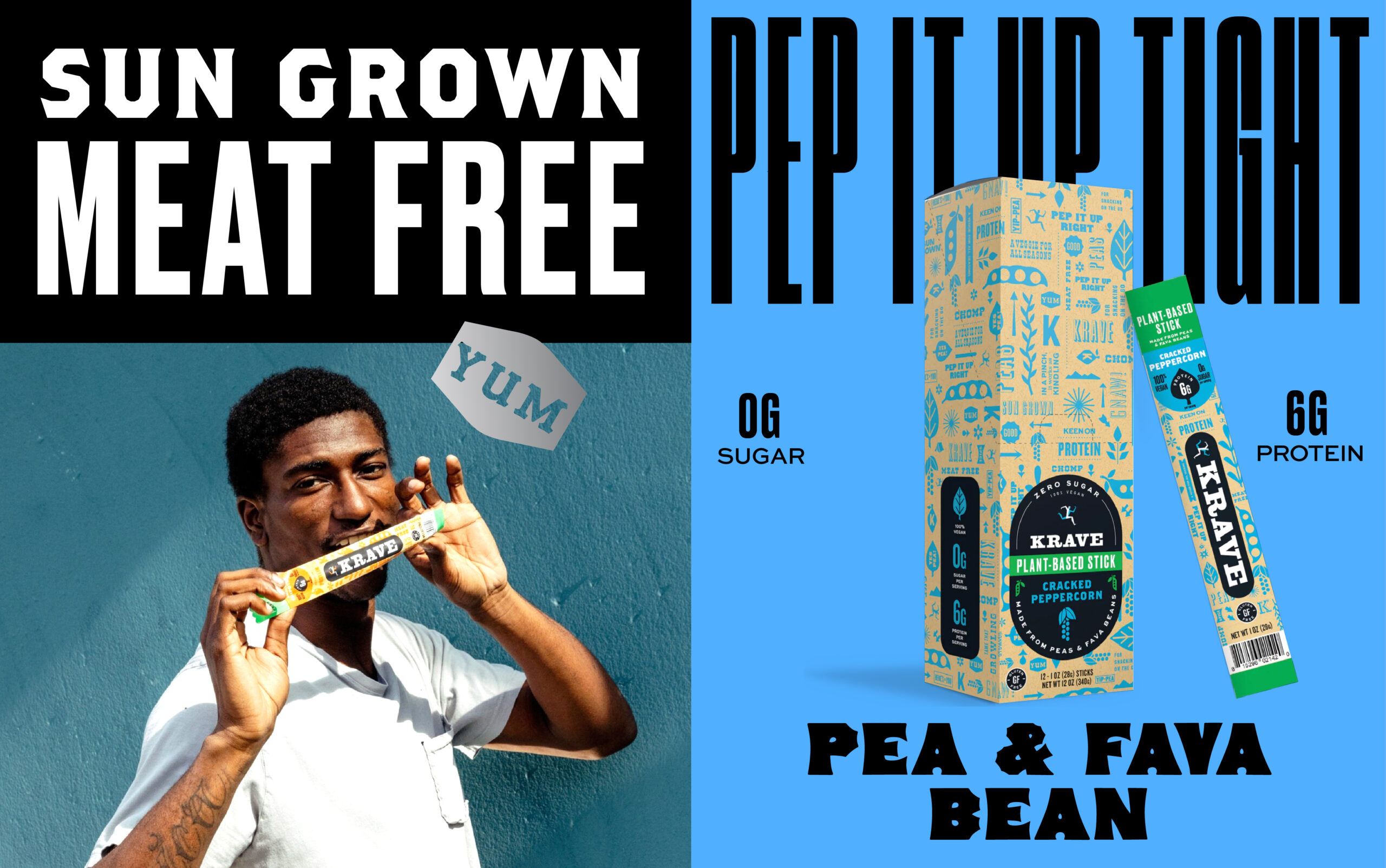
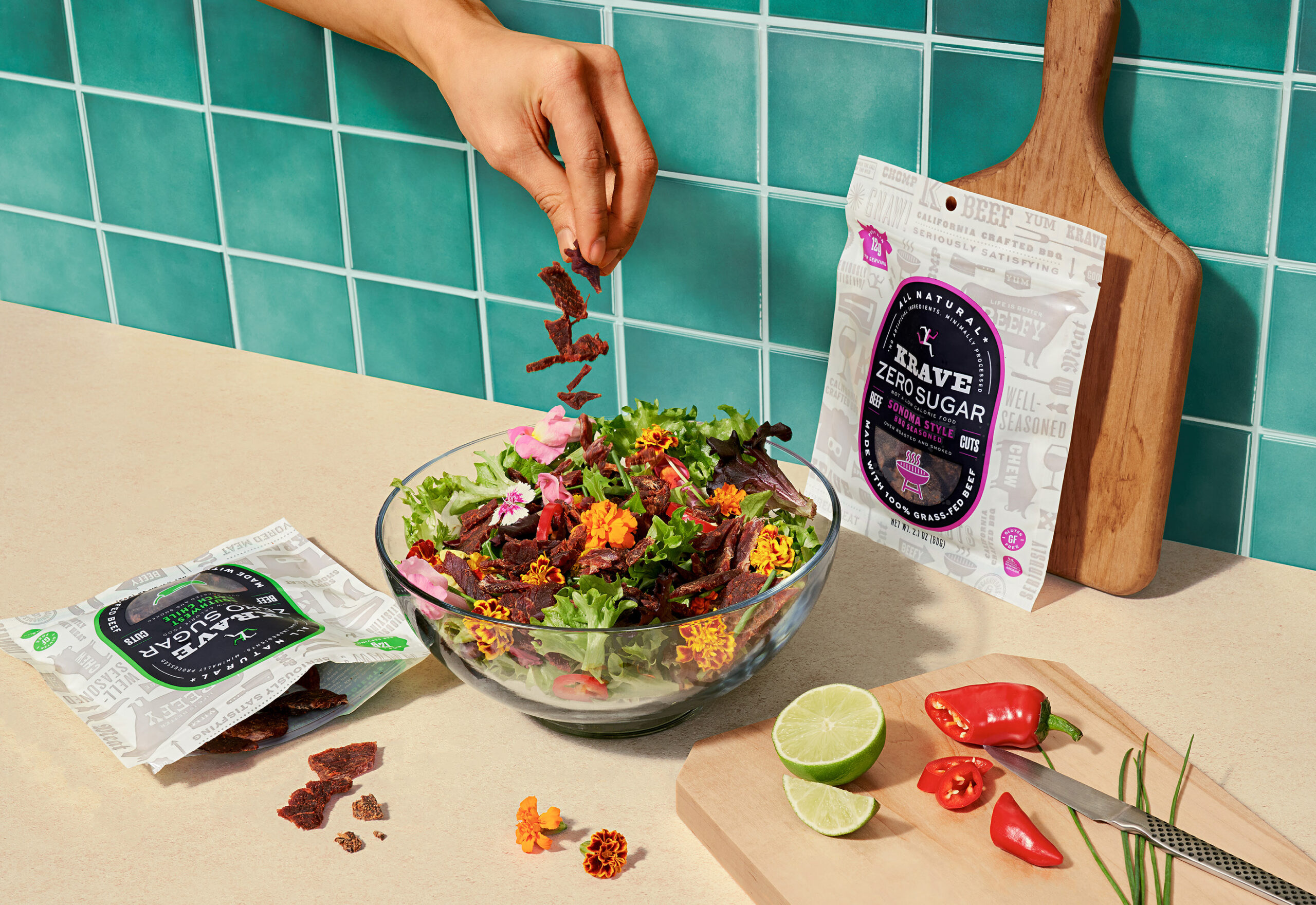
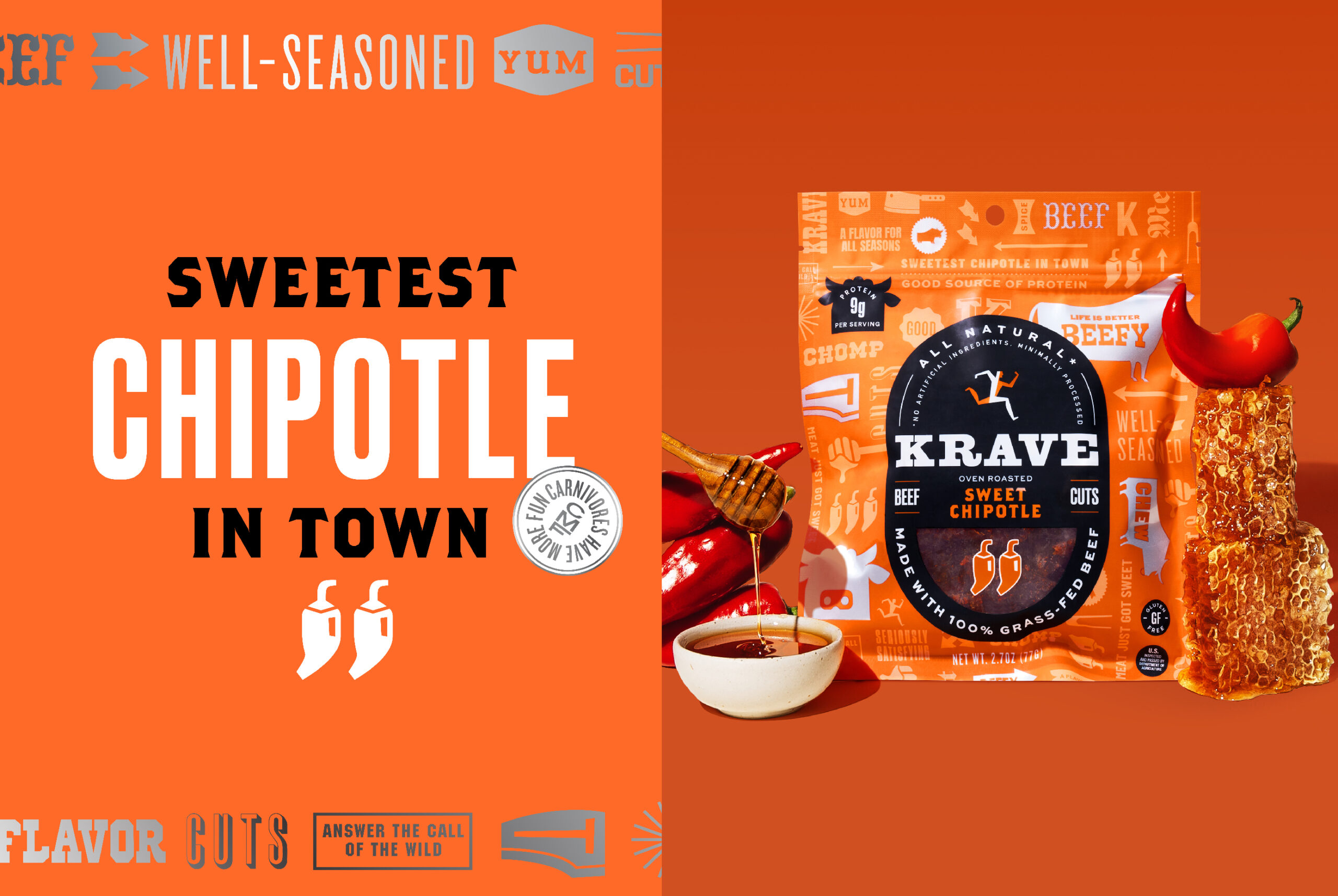
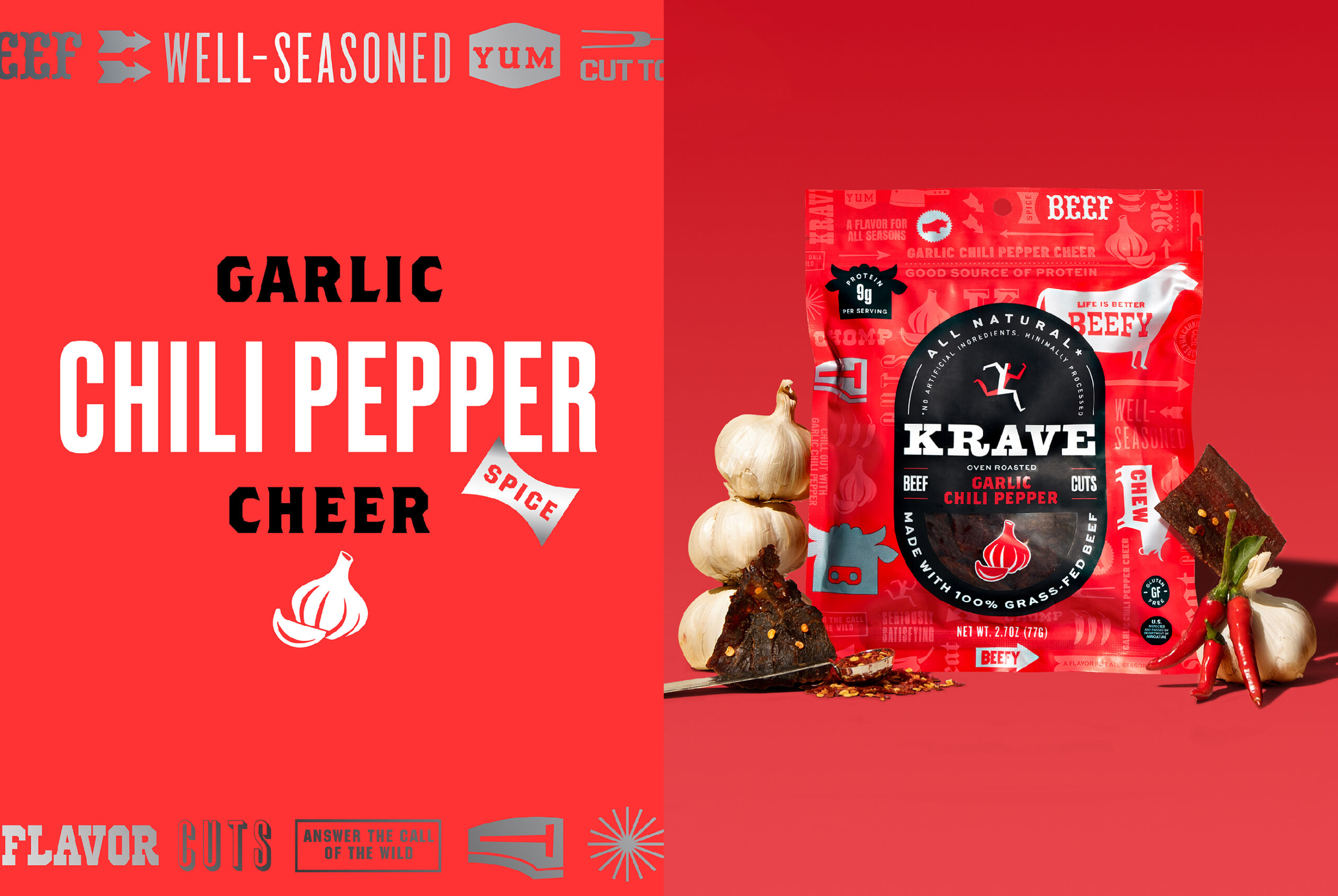
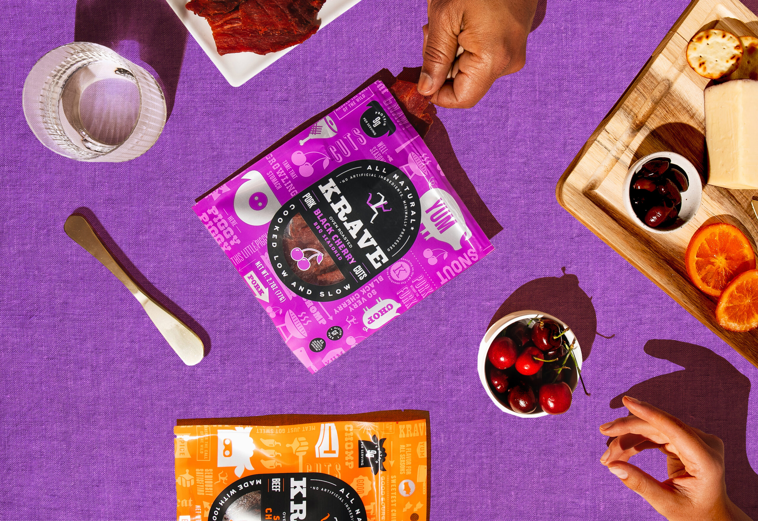
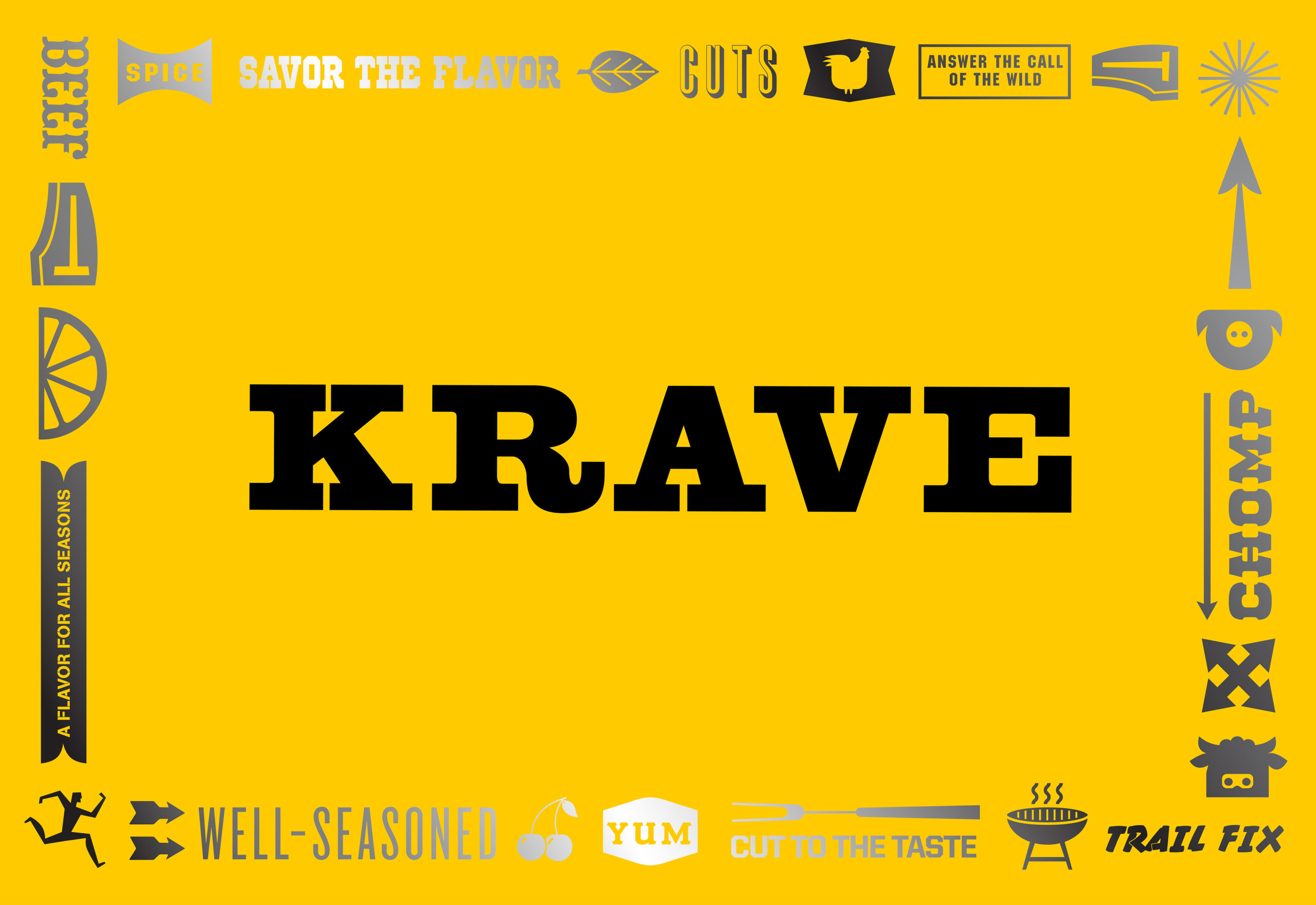
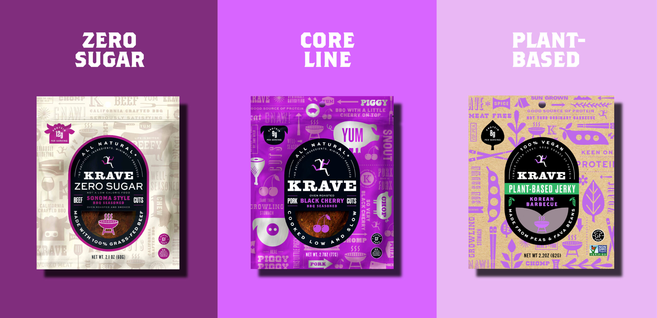
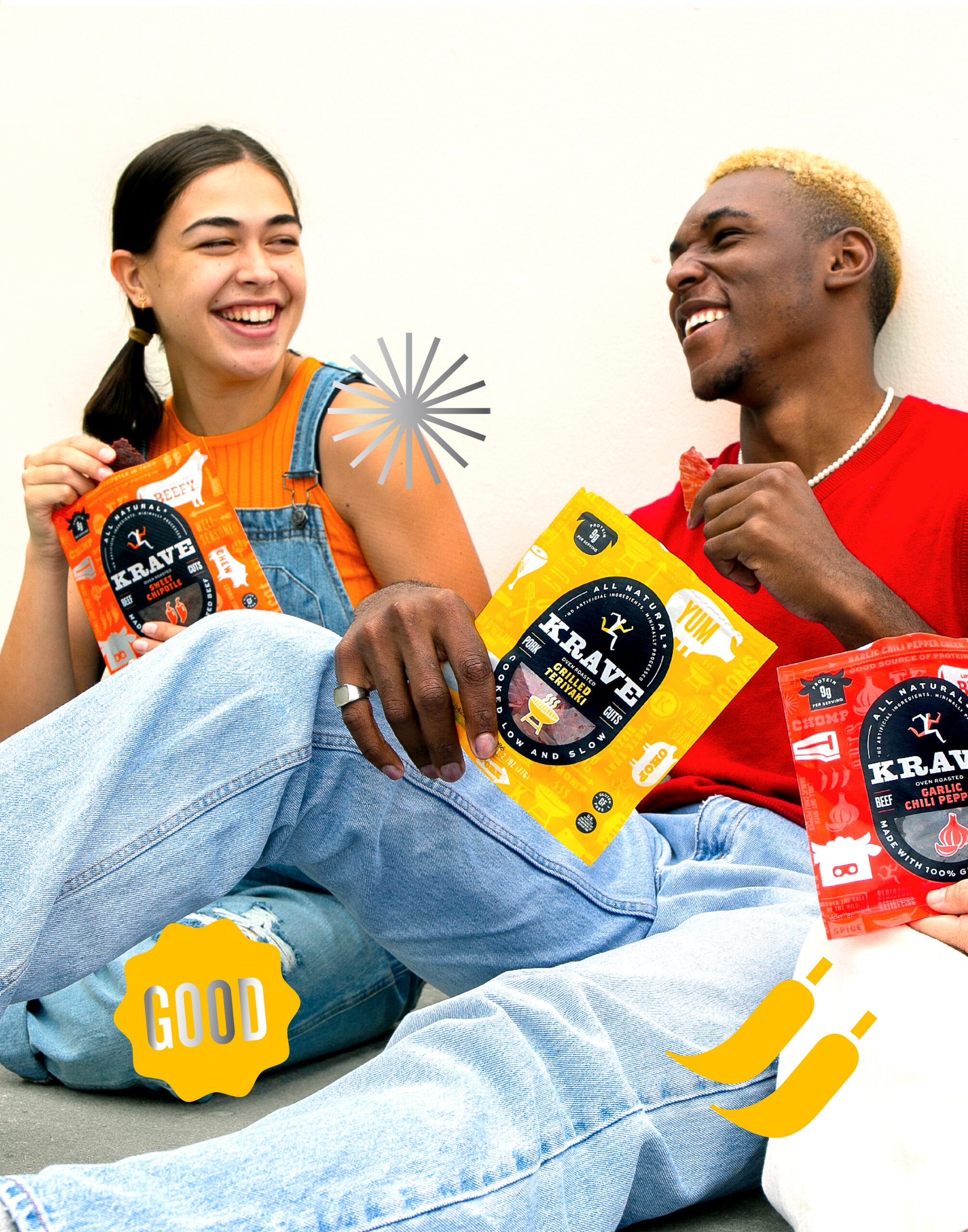
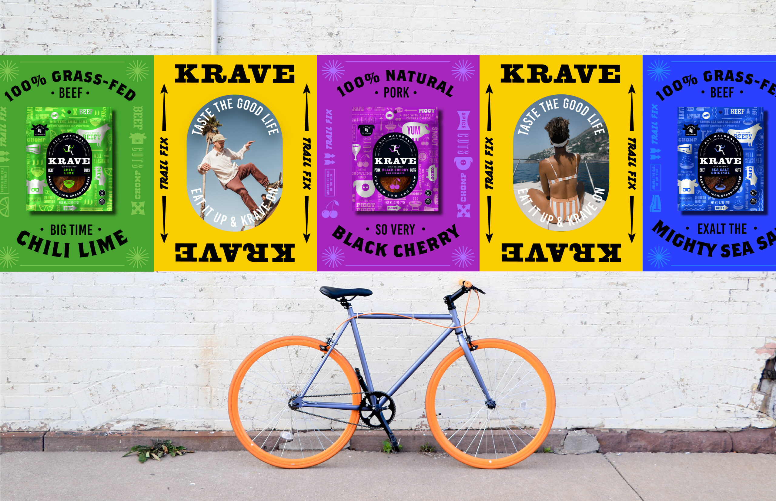
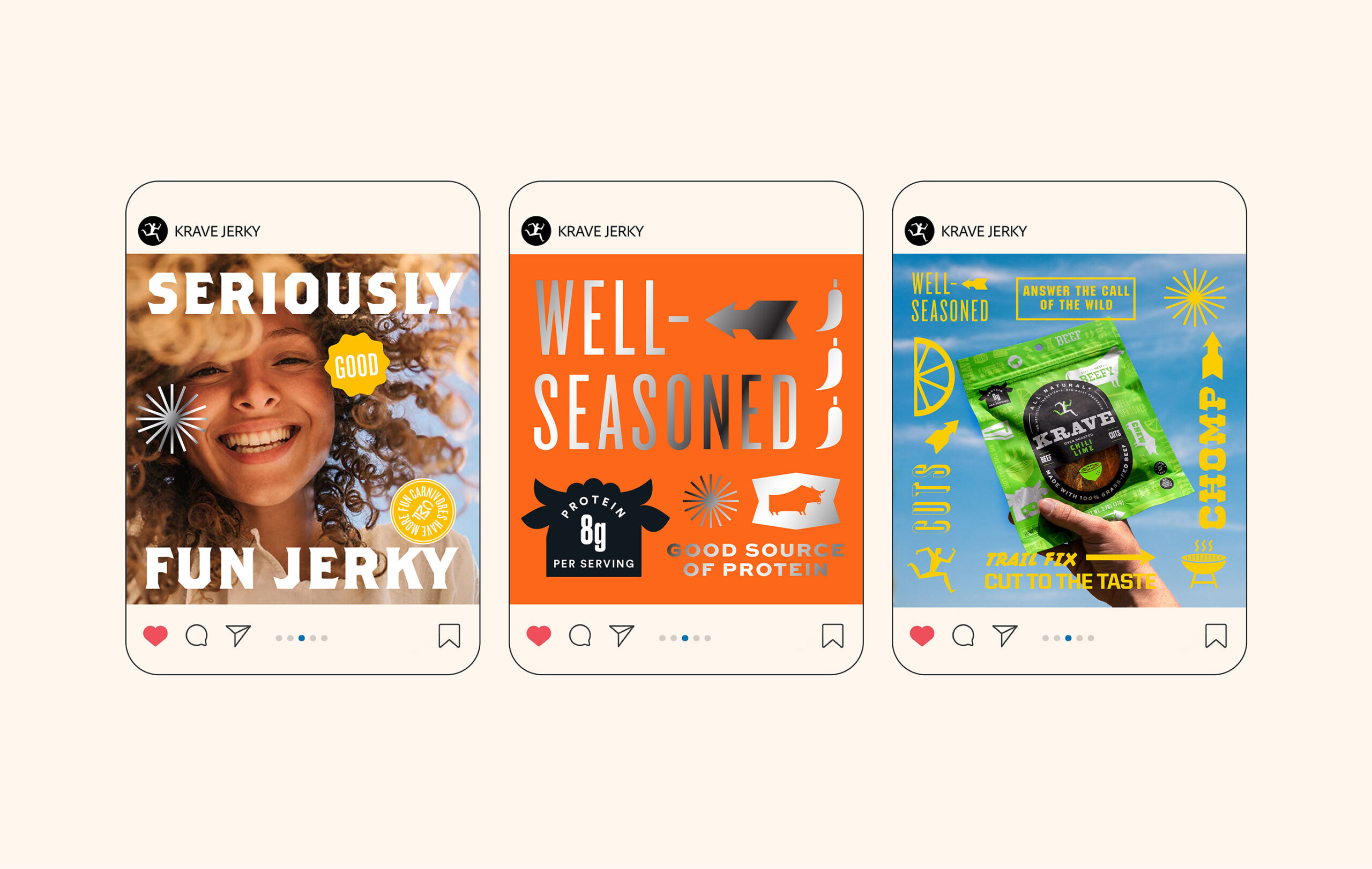
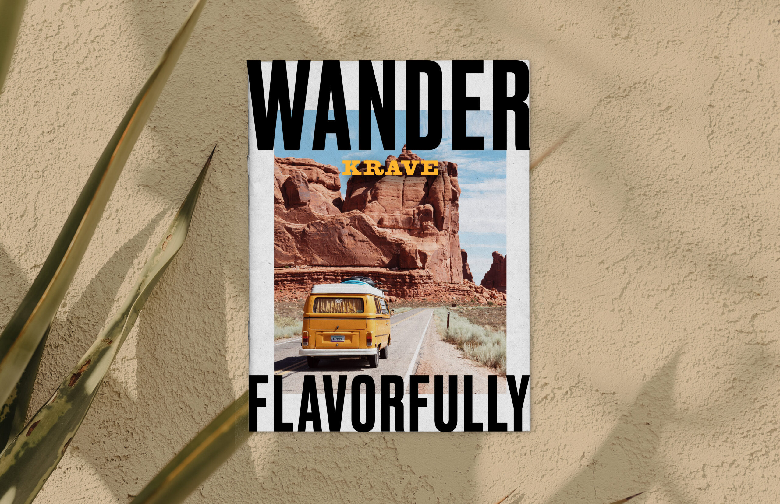
KRAVE’s personality was brought to the forefront with fresh energy through a new interpretation of existing equities – an updated pattern, bold colors, and animal-centric flavor claims. Once the core line was updated, Hatch developed a system extending across the entire portfolio, including innovations like plant-based jerky sticks, and brought the brand to life through an array of brand touchpoints.

See more case studies here. Interested in learning more?